The recent exchange on Twitter between Jonathan Portes and Tory Party Deputy Chairman Michael Fabricant suggested something quite worrying. A lot of MPs it seems do not know the difference between the debt and the deficit. If they don’t understand this, how can they come to a view about whether the economic situation warrants the imposition of austerity?
With this in mind I thought I’d do a quick post on debt and deficits to clear up a few misconceptions. To help me I’ll be nicking some charts from the excellent ukpublicspending.co.uk. First the national debt.

This first chart shows public net debt* between 1900 and 2011. This is a scary looking chart. Outstanding debt has seemingly exploded from almost zero in the mid 70s to almost £1 trillion in 2011. You will often hear the national debt discussed in these absolute terms, but obviously this lacks context.
When you hear David Cameron say the Government is “dealing with the debt”, or “paying down the debt”, he doesn’t mean the debt pile will shrink, he’s talking about slowing down the rate of increase, which doesn’t sound quite so impressive. The debt pile will probably keep rising in absolute terms for ever.

A more useful chart though is this one, showing debt as a ratio to GDP. This is quite a famous chart and shows that today’s national debt – despite having increased significantly in recent years – is still well below the levels seen in the past. The chart shows that for the entire period from the end of WWI to the early 60s – more than 40 years – debt as a proportion of GDP was higher than today. After WWII, debt reached almost 250% of GDP – more than two and a half times what it is today. Look how quickly it fell from that peak. How did that happen?
The answer is growth.** From 1948 to 1973, the economy grew almost continuously and at an average of 2.9% per annum. But the governments of the day must also have run balanced budgets or surpluses to “pay down the debt” right? Wrong. Lets now move on and look at the deficit.
In simple terms, a deficit (or surplus) is the difference between what a government collects in taxes, and what it spends. While the national debt is a stock measure of how much money the government owes, the deficit (or surplus) is the amount added to (or subtracted from) the national debt in a given year. So a deficit of £100bn increases the debt by £100bn. The only way to reduce the debt in absolute terms is for the government to run surpluses.
Now you will also often hear that governments should save in the good times and spend in the bad, but have past governments actually done this?
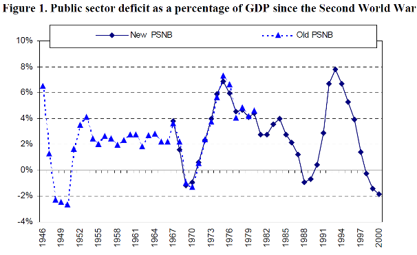
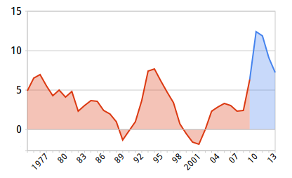
This chart*** is from this IFS report. You can see that of the 55 years between 1946 and 2000, the government ran a surplus in just 11 of those. 8 of those surpluses were 2% or less, while the largest budget deficit over that period was almost 8%. So this idea of balanced budgets over the cycle is a fiction. The average deficit has been around the 2-3% range (also roughly the size of Labour’s deficits prior to the crash). It is true to say though that since the financial crash deficits have been at their highest level since the Second World War. You can see that in this chart from here (the chart serves my purposes, but I don’t recommend the source. The strap-line at the top of the site would be correct without the No- at the front):
In a future post I might talk about whether we should be worried about this, and what conclusions we can draw from observing the size of the deficit alone, but to re-cap, the take-aways from this post should be:
- The best way to assess the size of the debt is to look at the net debt/GDP ratio;
- This ratio was larger than today for almost half of the last century;
- This ratio is brought down when the economy grows, not by balanced budgets or surpluses
- In the past, budget deficits have been the norm, while surpluses are relatively rare
* Net debt is the total amount of debt owed by the government to its creditors minus the value of financial assets held by the government. This is the measure generally used when discussing government debt.
** The GDP growth chart data comes from here.
*** The first version of this chart I uploaded copied very poorly, but a reader kindly sent me a much clearer version (h/t @sebschmoller)


One thought on “Government Debt and Deficits in Charts”