Following on from the last post on debt and deficits, this post will look at interest rates. This will be a somewhat superficial examination of the data as the reality of the link between debt, deficits and interest rates is a complex one, but I hope to show that the Government line on interest rates is at best simplistic, and at worst wildly misleading.
After the release of last week’s GDP figures, a succession of Ministers gave interviews where they mentioned the UK’s low interest rates as a positive outcome from austerity. The reasoning goes that if debt and deficits get too high, the markets will revolt and start demanding high interest rates on government debt. The Government’s argument is that since austerity began, the markets are now reassured that the Government is dealing with its debts (!!?) and so interest rates have remained low.
I think Jonathan Portes did a pretty good job of debunking this argument last year, but we are still hearing that this story that low interest rates indicate the success of austerity, so here are some charts that suggest something different. The data from all these charts comes from Trading Economics and is the latest available.

This first chart shows the debt-GDP ratios of a cross-section of countries (left hand axis) vs the interest rates they have to pay to borrow for 10 years (right hand axis). The Debt-GDP ratio remember, is the total amount the government owes, expressed as a % of GDP. In this chart, apart from a couple of outliers, in particular Japan, the blue line does trend downwards, i.e the lower a country’s debt, the lower the interest rate it has to pay. Lets show this chart again though, but with the Eurozone countries excluded.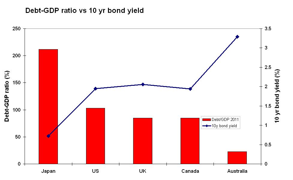 This time, something weird has happened. Whereas before it seemed like highly indebted countries had to pay high rates on their debt, now the opposite seems to be true. The country with far and away the highest government debt is Japan, but Japan also has the cheapest borrowing costs. And Australia, with the lowest debts, pay the highest rate. What’s different? All the five countries in the second chart have their own currencies, while the first chart contained countries that do not. But maybe it’s the size of the deficit rather than the debt that makes the market get anxious?

This is a similar chart, but this time the bars show each country’s deficit as a % of GDP. The UK is in the middle. If you squint a bit, you might be able to discern a slight negative relationship between the deficit and bond yields, but it’s pretty weak. So there doesn’t seem to be a clear link between deficit size and the rate governments pay to borrow money. All that’s left then is some sort of vague notion that markets don’t look at the numbers but at the intentions and credibility of each government. Does this sound convincing to you? It doesn’t to me.
Let’s just look at the Debt-GDP chart once more, but only including the Eurozone countries.

This time, it does seem that higher debts lead to higher interest rates. Why would this be true for Eurozone countries, but not other wealthy nations? Well, by joining the Euro, these countries gave up their right to set short term interest rates, devalue their currencies or to print money. This means when a crisis hits, these countries are unable to pull the usual policy levers. The bailouts of certain Eurozone countries have seen rates fall (Greek rates were aroung 35% a year ago), but ultimately, there is a real default risk on these nations debts, so yields are priced accordingly.
Nations with their own currencies do not have this inherent risk of default because they can always make any payment due in their own currencies. Ultimately, they can print money if needs be. So what does determine long term interest rates in these countries (the UK included)? Lets look at one more chart.

Here we have the 5 country’s central bank base rates next to the rate they pay on 10 year bonds. They are quite closely correlated. That’s because as Portes points out in his post I link to above:
“…theory suggests that the low level of long-term interest rates in the UK reflects low expected future short-term rates.”
Short term rates are low today, and market actors expect them to be low tomorrow, so long term rates are low. Central banks can manage expectations by pre-announcing their intentions on rates, as Ben Bernanke has done in the US. The markets are also crying out for safe assets, so there is a rush into bonds and away from more risky investments.
So to conclude then, the take-away messages from this post are:
- The link between high deficits/high debts and high bond yields only applies to countries like those in the Eurozone which do not have full control over their own currencies.
- The Government’s belief that their economic policies have ensured interest rates stayed low is based on magical thinking. The idea does not stand up to scrutiny.
- The real reason long term rates are so low is partly because short term rates (set by supposedly independent central banks) are so low, as are expectations about future rates, and partly because the world economy is so depressed and so the markets are looking to invest in safe assets.

Illuminating – now get it on the air – or not since #BBCtorypropagandist